本文链接:https://blog.csdn.net/qq_64760783/article/details/145739626
CSS渐变背景色
1. 线性渐变(Linear Gradient)
线性渐变沿着一条直线方向进行颜色过渡。使用 linear-gradient() 函数。
语法:
background: linear-gradient(direction, color-stop1, color-stop2, ...);
示例:
从左到右的渐变:
background: linear-gradient(to right, #ff7e5f, #feb47b);
对角渐变:
background: linear-gradient(to bottom right, #ff7e5f, #feb47b);
使用角度:
background: linear-gradient(45deg, #ff7e5f, #feb47b);
2. 径向渐变(Radial Gradient)
径向渐变从中心点向外辐射状进行颜色过渡。使用 radial-gradient() 函数。
语法:
background: radial-gradient(shape size at position, color-stop1, color-stop2, ...);
示例:
简单的径向渐变:
background: radial-gradient(circle, #ff7e5f, #feb47b);
指定位置的径向渐变:
background: radial-gradient(circle at 50% 50%, #ff7e5f, #feb47b);
3. 重复渐变(Repeating Gradient)
重复渐变可以创建重复的渐变效果,适用于线性渐变和径向渐变。
语法:
重复线性渐变:
background: repeating-linear-gradient(direction, color-stop1, color-stop2, ...);
重复径向渐变:
background: repeating-radial-gradient(shape size at position, color-stop1, color-stop2, ...);
示例:
重复线性渐变:
background: repeating-linear-gradient(45deg, #ff7e5f, #feb47b 10%);
重复径向渐变:
background: repeating-radial-gradient(circle, #ff7e5f, #feb47b 10%);
4. 圆锥渐变(Conic Gradient)
圆锥渐变围绕一个中心点旋转进行颜色过渡。使用 conic-gradient() 函数。
语法:
background: conic-gradient(from angle at position, color-stop1, color-stop2, ...);
示例:
简单的圆锥渐变:
background: conic-gradient(#ff7e5f, #feb47b, #ff6a6a);
指定起始角度和中心点:
background: conic-gradient(from 45deg at 50% 50%, #ff7e5f, #feb47b, #ff6a6a);
5. 透明度渐变
可以使用 rgba() 或 hsla() 颜色值来创建带有透明度的渐变。
示例:
background: linear-gradient(to right, rgba(255, 126, 95, 0.8), rgba(254, 180, 123, 0.8));
6. 组合渐变
可以将渐变与其他背景属性(如图片)组合使用。
示例:
background: linear-gradient(to right, rgba(255, 126, 95, 0.8), rgba(254, 180, 123, 0.8)), url('background-image.jpg');
7. 浏览器兼容性
为了确保在不同浏览器中的兼容性,可以使用浏览器前缀。
示例:
background: -webkit-linear-gradient(to right, #ff7e5f, #feb47b); /* Safari 5.1-6.0 */
background: -o-linear-gradient(to right, #ff7e5f, #feb47b); /* Opera 11.1-12.0 */
background: -moz-linear-gradient(to right, #ff7e5f, #feb47b); /* Firefox 3.6-15 */
background: linear-gradient(to right, #ff7e5f, #feb47b); /* 标准语法 */
8、一些好看的渐变背景色
1. 蓝紫色渐变

background: linear-gradient(135deg, #667eea 0%, #764ba2 100%);
2. 橙红色渐变
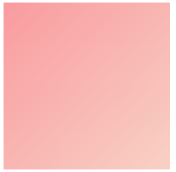
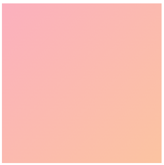
background: linear-gradient(135deg, #ff9a9e 0%, #fad0c4 100%);
3. 粉紫色渐变
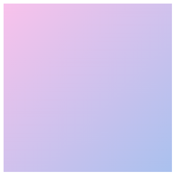
background: linear-gradient(135deg, #fbc2eb 0%, #a6c1ee 100%);
4. 青绿色渐变

background: linear-gradient(135deg, #43e97b 0%, #38f9d7 100%);
5. 日落色渐变
background: linear-gradient(135deg, #ff6f61 0%, #ffcc70 100%);
6. 深海蓝渐变

background: linear-gradient(135deg, #1e3c72 0%, #2a5298 100%);
7. 糖果色渐变
background: linear-gradient(135deg, #ff9a9e 0%, #fbc2eb 50%, #a18cd1 100%);
8. 金色渐变

background: linear-gradient(135deg, #ffd700 0%, #ff8c00 100%);
9. 薄荷绿渐变

background: linear-gradient(135deg, #00cdac 0%, #8ddad5 100%);
10. 紫红色渐变
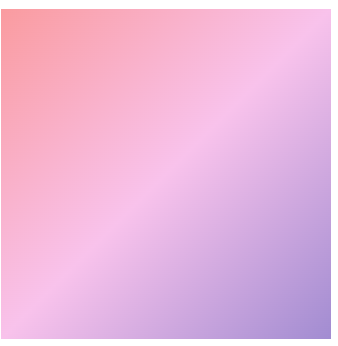
background: linear-gradient(135deg, #d66d75 0%, #e29587 100%);
11. 星空渐变

background: linear-gradient(135deg, #1e3c72 0%, #2a5298 50%, #1e3c72 100%);
12. 热带渐变

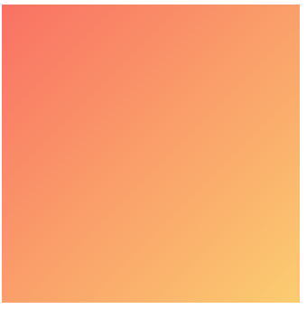
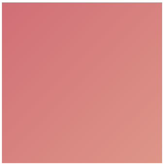
background: linear-gradient(135deg, #ff7e5f 0%, #feb47b 100%);
13. 冷灰色渐变

background: linear-gradient(135deg, #bdc3c7 0%, #2c3e50 100%);
14. 粉蓝色渐变
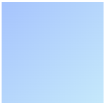
background: linear-gradient(135deg, #a1c4fd 0%, #c2e9fb 100%);
15. 霓虹渐变

background: linear-gradient(135deg, #ff00cc 0%, #333399 100%);
16. 森林绿渐变
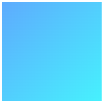
background: linear-gradient(135deg, #4facfe 0%, #00f2fe 100%);
17. 暖黄色渐变
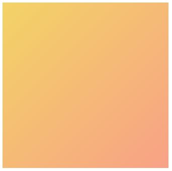
background: linear-gradient(135deg, #f6d365 0%, #fda085 100%);
18. 冷蓝色渐变

background: linear-gradient(135deg, #4b6cb7 0%, #182848 100%);
19. 粉橙色渐变
background: linear-gradient(135deg, #ffafbd 0%, #ffc3a0 100%);
20. 深紫色渐变
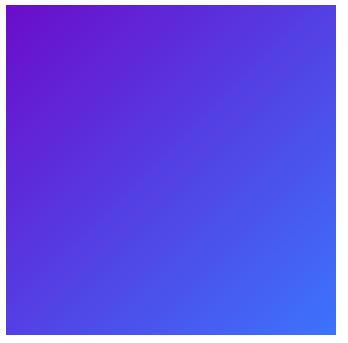
background: linear-gradient(135deg, #6a11cb 0%, #2575fc 100%);
小提示