本文链接:https://blog.csdn.net/qq_64760783/article/details/136325733
css实现子盒子在父级盒子中上下左右居中
几种常用的上下左右居中方式
HTML代码部分
<div class="box">
    <img src="./img/77.jpeg" alt="" class="img"></div>
css部分
方式一
利用子绝父相和margin:auto实现
<style>
    body{
      margin: 0;
    }
    .box{
      height: 100vh;
      background-color: hotpink;
      position: relative;
    }
    .img{
      position: absolute;
      top: 0;
      left: 0;
      bottom: 0;
      right: 0;
      margin: auto;
    }</style>
方式二
利用子绝父相和css3的transform属性实现
<style>
      body {
        margin: 0;
      }
      .box {
        height: 100vh;
        background-color: hotpink;
        position: relative;
      }
      .img {
        position: absolute;
        top: 50%;
        left: 50%;
        transform: translate(-50%, -50%);
      }</style>
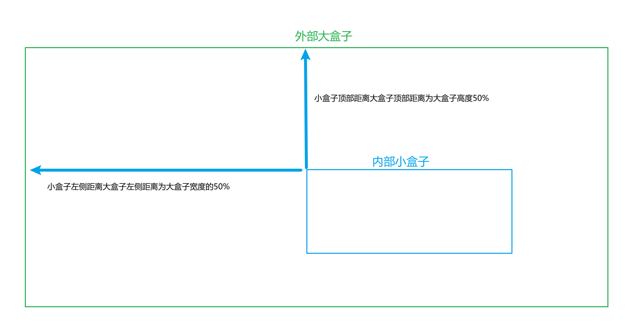
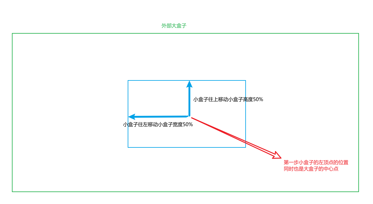
首先把内部盒子的位置设置为顶部和左侧距离大盒子顶部和左侧都是大盒子高度和宽度的50%;然后再把小盒子的顶部和左侧的位置都回退内部小盒子高度和宽度的50%;这样就刚好实现小盒子上下左右都居中在大盒子内部
图示:第一步
第二步:
方式三
利用flex布局实现(弹性盒子)
<style>
      body {
        margin: 0;
      }
      .box {
        height: 100vh;
        background-color: hotpink;
        /* 对box大盒子启用flex(弹性盒子)布局 */
        display: flex;
        /* 定义box中的项目(对于启用flex布局的元素(父元素,也称之为容器),其内部的子元素统一的称之为项目)在交叉轴(flex布局中的定义:垂直方向上的轴线,水平的轴线称之为主轴)上的对齐方式: 上下居中 */
        align-items: center;
        /* 定义项目在主轴上的对齐方式:左右居中;图片高度会撑满 */
        justify-content: center;
      }</style>
方式四
利用grid布局实现(网格布局)
<style>
      body {
        margin: 0;
      }
      .box {
        height: 100vh;
        background-color: hotpink;
        /*  在父元素上开启网格布局,采用网格布局的父元素被称之为容器(container),内部采用网格定位的子元素,称为"项目"(item)  */
        display: grid;
      }
      .img {
        display: inline-block;
        /* align-content属性是整个内容区域的垂直位置(上中下) */
        align-self: center;
        /* justify-content属性是整个内容区域在容器里面的水平位置 */
        justify-self: center;
      }</style>
方式五
利用display: flex和margin: auto实现
<style>
      body {
        margin: 0;
      }
      .box {
        width: 100vw;
        height: 100vh;
        background-color: hotpink;
        display: flex;
      }
      .img {
        /*上下左右都居中*/
        margin: auto;
      }
    </style>
方式六
待更新…